
What if you could visualize the invisible? What if you could create a physical, living presence from the intangible asset that is your brand? What if your online reputation could manifest as a piece of art? It’s Friday, so “turn it up”, as we bring you 12 months of Rory McIlroy…in the form of a squelchy, acidic, electronic beat.
Here at Adoreboard we tracked Rory McIlroy and the brands he represents over a 12 month period, revealing new insight into Mcilroy’s performance compared to his main sponsors and some of the world’s most iconic brands. Now, together with our friends atPatchblocks, we turned that research into a beat and showed, through data visualization, how this could be represented in a audio-visual 3D space .
And it goes a little something like this…
Science summary: the emotion of a beat
First revealed last month at Field.work, a data festival organised byHavas helia, the visualization and music was powered by emotion levels and activity volume of Rory McIlroy’s presence on the public web. Major data sources being tracked include Twitter, Facebook and online news, thus bringing together a comprehensive overview of the public perception for the 25 year old golfing superstar.
Audio data
The dominant emotion for each month decided what Patchblock(cool little DIY programmable synths) was being played, whilst the Adorescore and Twitter activity volume changed the parameters of the patch (filter cutoff, frequency and resonance). A degree of normalization was then applied to smooth the sound and reduce noise.

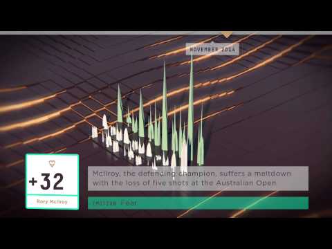
Visual data
The emotion score is visualized by the coloured graph, with each colour and shape representing a different month, whilst the grey represents the classic 808 and 303 Roland machines. If you’ve eagle eyes you might just catch a glimpse of the original machines here, as Hardfloor perform their classic Acperience live for MTV in the late 90’s. The 808 drives the beat, whilst the 303 drives the ‘acid’ synthy sounds. Classic.
So…back to brands and data…
As we know, brands are fairly intangible, their value can be difficult to assess, yet is often the number one asset of the company. Intangible assets produce fuzzy data and lend themselves to high level understanding and appreciation, rather than than hard facts and figures.
This audio-visualisation of Rory McIlroy’s brand perception over time is not only a piece of quirky art, but provides an inherent feeling and understanding of a journey. A journey that cannot be fully expressed appreciated or understood using timelines, histograms and pie charts.
So as we continually seek to better understand data through visualization, ask yourself “if your brand had a beat, what would it be?”
You can download the full Rory McIlroy report here (it’s free!).
With a poor start in the Irish Open this week, Rory McIlroy’s Adorescore dipped to 20. Let’s hope things improve as the local hero pledged any prize money to the Rory Foundation, a charity that helps children and their families such as the amazing Cancer Fund For Children.
If you liked this…you might just like what we did with Sheldon and Ministry of Sound.
Happy Friday!


