Listen up marketers. There’s a brave new world out there. And for your potential customers, it’s one of information overload and big data. So in this new environment, your job just got a whole lot harder. That’s right, if you are not finding already, it’s increasingly harder to cut through the noise and persuade customers about your product.
When you think about it – why should people care? Aren’t we all bored of the next new thing – be it Follicle Stimulating Shampoo or Cat Food in pouches scientifically formulated with appetising things and enriched with laughter?
So here’s the secret – cut the words and up your game on data visualisation to thrill, entertain and persuade customers to care about what you have to say. Give the audience something that matters, then people will start caring…
Give the audience something that matters
So let’s take the first part – give the world something that matters?
It’s important that you first start by looking for a compelling data type to use. Take a scenario where you are pitching to win new business for your agency. How powerful would it be to stand-up during a new business pitch and say to the audience that you are going to tell them something they themselves don’t know about their own brand? It’s a big promise. What if you could say, we’ve looked at the data and we can actually tell you here are the emotions that people feel towards your brand, this is why your competitor is eating your lunch and this is how we are going to change that. I mention this because this is the sort of data analytics, that Adoreboard provides to advertising, PR and social media agencies for winning pitch scenarios.
So once you have the data, how do you use that to actually persuaded?
The Science of Persuasion
For any person to persuade, they must first understand which type of persuasion their audience will use and why. So now for the science. A well-known social psychological model to explain this is known as the Elaboration-Likelihood Model(ELM). Developed in 1986 by Ohio State University Professor Richard E. Petty and University of Chicago Professor John Cacioppo, the model uncovered that people differ in the extent to which they think about messages creating two ways to be persuaded.
Let’s look at the first. It’s known as the Central Route, where people think deeply and carefully about a message. Persuasion is achieved here by careful consideration of the information placed in a message. An example of this persuasion is carefully listening and thinking about a politician’s speech during a TV debate.
The second way is the Peripheral Route where people think little about a message. Persuasion is achieved here by a practical evaluation of surface qualities of the message (e.g. is a famous actor in the advert, is there nice music playing). So let’s be honest, how many of us have rushed out to buy a Nespresso after watching its advert with George Clooney?
Recent psychological studies indicate whilst data is a useful persuasive tool, it’s effectiveness is dramatically enhanced when visualised.
So let’s look at how to persuade using data visualisation.
The Persuasive Effects of Data Visualisation
According to the renowned data visualisation expert Stephen Few, data is visualised to serve three purposes:
1) Searching for significant and important facts (exploration) 2) Identifying and understanding the data (sense making) 3) Conveying information to others (communication)
Stephen Few makes the point that data visualisation can deliver all three functions due to our own visual ability to process information. Here is a practical example of data when visualised takes on new persuasive effects. The example is from an IAMS Cat Food advert from a view few years ago by visualising comparing its nutritional value against its competitors.

Even basic data visualisations work. Last year, Cornell University researchers Aner Tal and Brian Wansink presented a group of participants with a vague blurb detailing the effectiveness of a fictitious drug. When asked, 68% of the participants thought the drug was effective. The researchers then brought a different group of participants in and showed them the same message, along with a simple graph visualising the effectiveness of the drug. This time 97% of participants thought the drug was effective.
The inclusion of a graph increased the persuasiveness of a message by nearly 30%.
Even though there is a substantial potential for this effect to be abused, it can also be argued that this finding presents a different and improved way of thinking about persuasion. Instead of relying on stories to persuade, using data and data visualisation will make any message more substantial. The pitch to attract new business opportunities can be augmented with the help of line graphs showing the evolution of growth for a company. An advertising campaign can easily attract customers by visualising its advantage over its competitors. Indeed, supermarkets use this tactic regularly for example, Asda’s usage of mysupermarket.co.uk data to do such a thing helps to explain its recent popularity.
How Adoreboard persuades?
We think marketers have a tough enough job already rather than complicate it with realms of data. In fact, when we speak with marketers one of the key jobs to be done is around internal reporting on the effectiveness of marketing campaigns. So how do we achieve that?
Simplicity.

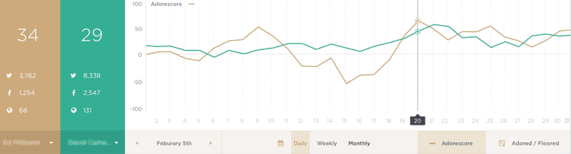
Data at its core is valuable when used to inform a decision. With this in mind, Adoreboard have developed an easy to understand metric called the Adorescore – which acts like a real-time stock price for your brand online. Whilst the elements, which make up the Adorescore are complex and developed by data scientists at Queen’s University, Belfast the presentation of this in a single number is simple.
By visualising the mass of data that the Adorescore encounters, the user Interface provides an easy and quick, but authoritative, source of data analytics through simple graphs. Customers using the software can clearly see all emotions expressed online about their products and their competitors. In doing so, the Adorescore fulfils all three purposes of data visualisation outlined by Stephen Few (see earlier). By supplying this intelligence, we allow users to persuade their co-workers about the public’s view of a particular product, we allow brand managers to see the effectiveness of a particular campaign, and we add to a school of thinking which recognises and utilises the persuasive power of data and data visualisation.
So in summary:
- There are different ways to persuade, the most effortless requires little thought from your audience.
- Data visualisation enhances your ability to persuade.
- Persuasive communication is brought to life good data visualising.
- You can start today as even the most basic data visualising enhances your effectiveness.
Sources:
https://www.perceptualedge.com/blog/?p=1897https://pus.sagepub.com/content/early/2014/09/23/0963662514549688.full.pdf+html